Design and feature discovery suggestions #24

Closed
opened 2021-05-04 20:41:06 +00:00 by ztimms73 · 21 comments
ztimms73 commented 2021-05-04 20:41:06 +00:00 (Migrated from github.com)

Here is a list of things that could improve the app in terms of design and feature discovery:

  • Abandoning the old design. Transition to a cleaner, simpler, and more intuitive design according to the Material Design guidelines;
  • Single-step actions (TapTargetView). Prompt users to try features or functionality that can be completed in a single tap;
  • Maybe use BottomNavigationView instead of NavigationDrawer? In this case, need to figure out where to place the list of online sources;
  • Material 3 (You). But this is after the release of Android 12, the stable version of the Material Components library (now 1.5.0 in alpha), and for a major release (maybe with the Kotatsu 4.0 or 5.0 version) 3.0 I think.
Here is a list of things that could improve the app in terms of design and feature discovery: - [x] Abandoning the old design. Transition to a cleaner, simpler, and more intuitive design according to the Material Design guidelines; - [ ] Single-step actions (TapTargetView). Prompt users to try features or functionality that can be completed in a single tap; - [ ] Maybe use `BottomNavigationView` instead of `NavigationDrawer`? In this case, need to figure out where to place the list of online sources; - [x] Material 3 (You). But this is after the release of Android 12, the stable version of the Material Components library ~~(now 1.5.0 in alpha)~~, and for a major release ~~(maybe with the Kotatsu 4.0 or 5.0 version)~~ 3.0 I think.
ztimms73 commented 2021-06-13 22:55:22 +00:00 (Migrated from github.com)

Here, by the way, are the results of the UI change. As for me, the interface looks fresh, the detailed list of manga looks cool. However, there is no need for a theme engine, as the app looks beautiful in light and dark themes.

Light theme Dark theme
Screenshot_1623624154 Screenshot_1623624567
Here, by the way, are the results of the UI change. As for me, the interface looks fresh, the detailed list of manga looks cool. However, there is no need for a theme engine, as the app looks beautiful in light and dark themes. | Light theme | Dark theme | | ------------- | ------------- | | ![Screenshot_1623624154](https://user-images.githubusercontent.com/61558546/121824087-2b70f480-ccb2-11eb-8691-d36baff58c2b.png) | ![Screenshot_1623624567](https://user-images.githubusercontent.com/61558546/121824237-69bae380-ccb3-11eb-97fe-f2b880ab9619.png) |
Koitharu commented 2021-06-14 10:35:27 +00:00 (Migrated from github.com)

Looks cool and modern

Looks cool and modern
ztimms73 commented 2021-06-14 21:43:54 +00:00 (Migrated from github.com)

More than half of the work has already been done on the interface. MaterialSearchView had to be temporarily removed due to some difficulties and returned back to the Toolbar, but still, I will try to get it back. fragment_details.xml was also very much changed, the elements of the detailed manga and the grid were changed. Now it remains to make the interface for the tablet and fix some cosmetic flaws.

Details Grid Detailed list Updated headers
Screenshot_1623705640 Screenshot_1623705652 Screenshot_1623705659 Screenshot_1623705668
Screenshot_1623705720 Screenshot_1623705713 Screenshot_1623705706 Screenshot_1623705703
More than half of the work has already been done on the interface. MaterialSearchView had to be temporarily removed due to some difficulties and returned back to the Toolbar, but still, I will try to get it back. `fragment_details.xml` was also very much changed, the elements of the detailed manga and the grid were changed. Now it remains to make the interface for the tablet and fix some cosmetic flaws. | Details | Grid | Detailed list | Updated headers | | ------------- | ------------- | ------------- | ------------- | | ![Screenshot_1623705640](https://user-images.githubusercontent.com/61558546/121962303-4191ba00-cd71-11eb-9b45-95d9c2b9524d.png) | ![Screenshot_1623705652](https://user-images.githubusercontent.com/61558546/121962396-5f5f1f00-cd71-11eb-9f48-e1e1f6e1f47b.png) | ![Screenshot_1623705659](https://user-images.githubusercontent.com/61558546/121962430-66862d00-cd71-11eb-8941-5adf97a9aeee.png) | ![Screenshot_1623705668](https://user-images.githubusercontent.com/61558546/121962457-6dad3b00-cd71-11eb-9afc-6fb145578d52.png) | ![Screenshot_1623705720](https://user-images.githubusercontent.com/61558546/121962351-51110300-cd71-11eb-98fc-a3c0562ee4c4.png) | ![Screenshot_1623705713](https://user-images.githubusercontent.com/61558546/121962471-7271ef00-cd71-11eb-8114-7b28583b9a6e.png) | ![Screenshot_1623705706](https://user-images.githubusercontent.com/61558546/121962482-7736a300-cd71-11eb-8536-d594d0a4cbe5.png) | ![Screenshot_1623705703](https://user-images.githubusercontent.com/61558546/121962491-7b62c080-cd71-11eb-8374-cc170318ada3.png) |
Koitharu commented 2021-06-15 04:08:45 +00:00 (Migrated from github.com)

Very cool. Also, I think, first version of list is better, the second one has too large images

Very cool. Also, I think, first version of list is better, the second one has too large images
ztimms73 commented 2021-06-18 19:52:55 +00:00 (Migrated from github.com)

So, is a Toolbar in MaterialCardView a good idea? Then there is no need for MaterialSearchView

Video demonstration

So, is a Toolbar in MaterialCardView a good idea? Then there is no need for MaterialSearchView [Video demonstration](https://drive.google.com/file/d/1ZC7cveDg9oTU1uCKryAIojXGjUt0Ac0K/view?usp=sharing)
Koitharu commented 2021-06-20 11:52:22 +00:00 (Migrated from github.com)

Toolbar in MaterialCardView

Yes, it is simple and looks good

> Toolbar in MaterialCardView Yes, it is simple and looks good
ztimms73 commented 2021-07-26 20:39:19 +00:00 (Migrated from github.com)

Is it a good idea to animate layouts, namely transitions of components in visible and vice versa? Or does it overload the interface?

https://drive.google.com/file/d/1q9ExKRCUey5py1KkAUiXZnK7TanHcO6g/view?usp=sharing

Is it a good idea to animate layouts, namely transitions of components in visible and vice versa? Or does it overload the interface? https://drive.google.com/file/d/1q9ExKRCUey5py1KkAUiXZnK7TanHcO6g/view?usp=sharing
Koitharu commented 2021-07-27 05:21:27 +00:00 (Migrated from github.com)

Or does it overload the interface?

Yes. I think, now it is OK

> Or does it overload the interface? Yes. I think, now it is OK
Koitharu commented 2022-01-15 16:23:20 +00:00 (Migrated from github.com)

Material components 1.5.0 is released now, what do you think about Material 3?

Material components 1.5.0 is released now, what do you think about Material 3?
ztimms73 commented 2022-01-15 19:49:58 +00:00 (Migrated from github.com)

Material components 1.5.0 is released now, what do you think about Material 3?

I'm on it)

> Material components 1.5.0 is released now, what do you think about Material 3? I'm on it) <img src="https://user-images.githubusercontent.com/61558546/149635790-1ce150af-b7a1-4a23-8e7a-32ec06a0b68a.png">
ztimms73 commented 2022-01-16 01:25:34 +00:00 (Migrated from github.com)

That's what I got. The appearance is not yet final. Looks pretty good to me. Then need to fix minor UI errors and crashes later.
Useful links: Guidelines, Material Theme Builder

Default theme Pseudo-dynamic (need to implement dynamic theme option for users with A12). My emulator doesn't support dynamic colors from wallpapers, then I created resource file with yellow color
Screenshot_1642295229 Screenshot_1642295470
Screenshot_1642295398 Screenshot_1642295473
Screenshot_1642295247 Screenshot_1642295494
Screenshot_1642295382 Screenshot_1642295496
That's what I got. The appearance is not yet final. Looks pretty good to me. Then need to fix minor UI errors and crashes later. Useful links: [Guidelines](https://m3.material.io), [Material Theme Builder](https://material-foundation.github.io/material-theme-builder) |Default theme|Pseudo-dynamic (need to implement dynamic theme option for users with A12). My emulator doesn't support dynamic colors from wallpapers, then I created resource file with yellow color| |---|---| |![Screenshot_1642295229](https://user-images.githubusercontent.com/61558546/149643614-9e691cea-0cee-4a69-b7bc-235eae8a3ab5.png)|![Screenshot_1642295470](https://user-images.githubusercontent.com/61558546/149643624-ac405886-3c02-43f7-ae06-17c3ee316c47.png)| |![Screenshot_1642295398](https://user-images.githubusercontent.com/61558546/149643641-f1344b7a-c278-4bd1-90cf-9dd44ce46c5c.png)|![Screenshot_1642295473](https://user-images.githubusercontent.com/61558546/149643645-e01b46a9-8f47-48be-9f10-c3f8030b165d.png)| |![Screenshot_1642295247](https://user-images.githubusercontent.com/61558546/149643652-e3614976-3ff6-4753-8225-914d05417584.png)|![Screenshot_1642295494](https://user-images.githubusercontent.com/61558546/149643655-f19b8d3b-479f-4b42-b7dc-368a6a03f5e2.png)| |![Screenshot_1642295382](https://user-images.githubusercontent.com/61558546/149643660-e2c41bdc-04fd-4365-8363-82db93001d19.png)|![Screenshot_1642295496](https://user-images.githubusercontent.com/61558546/149643667-f97c29c6-1b31-476e-9b22-b1cdf68a98f9.png)|
ztimms73 commented 2022-01-17 03:04:59 +00:00 (Migrated from github.com)

What do you think about this?

Screenshot_1642388482 Screenshot_1642388478
What do you think about this? | ![Screenshot_1642388482](https://user-images.githubusercontent.com/61558546/149701682-e66943e0-aa77-4bbf-b5bc-c88aafdac575.png) | ![Screenshot_1642388478](https://user-images.githubusercontent.com/61558546/149701675-4dc070d1-7279-4645-a38e-00d9138b1d78.png) | |---|---|
Koitharu commented 2022-01-17 05:52:42 +00:00 (Migrated from github.com)

I think no, standard drawer is better.

I think no, standard drawer is better.
Koitharu commented 2022-01-17 05:57:09 +00:00 (Migrated from github.com)

Bottom sheet drawer can be used for filters, but without a bottom appbar, it consume a lot of useful space

Bottom sheet drawer can be used for filters, but without a bottom appbar, it consume a lot of useful space
ztimms73 commented 2022-02-19 23:53:30 +00:00 (Migrated from github.com)

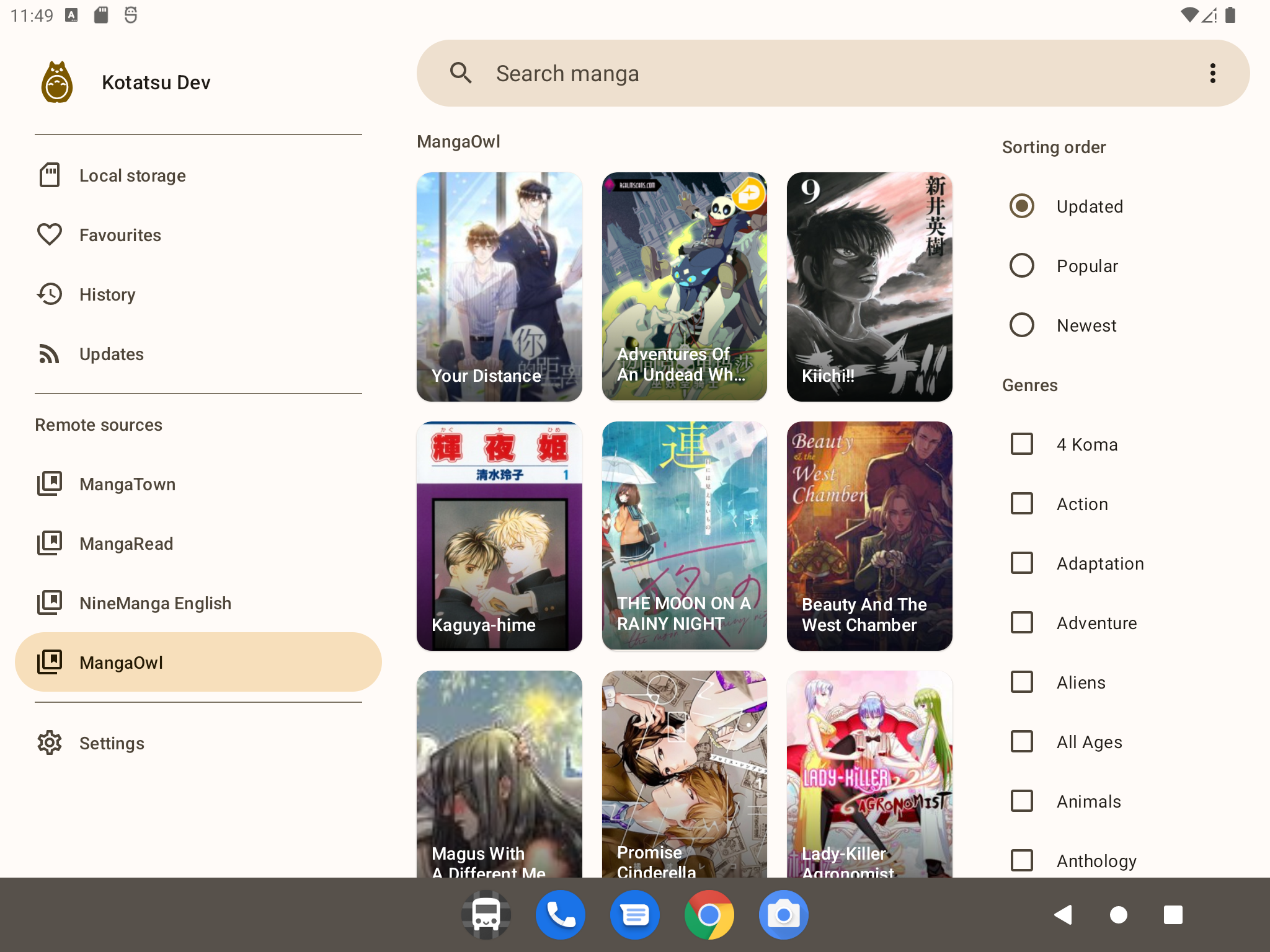
I'm on improving UI on tablets :)
Screenshot_20220220_025008

I'm on improving UI on tablets :) ![Screenshot_20220220_025008](https://user-images.githubusercontent.com/61558546/154823027-992ffef7-cead-4819-bd06-9ba879e3e28c.png)
Koitharu commented 2022-02-20 16:06:41 +00:00 (Migrated from github.com)

Looks nice, and, I think, drawer should be smaller, it takes too much space)

Looks nice, and, I think, drawer should be smaller, it takes too much space)
nknodev commented 2022-02-23 16:54:02 +00:00 (Migrated from github.com)

Maybe make a desktop app?)

Maybe make a desktop app?)
ztimms73 commented 2022-02-23 20:59:09 +00:00 (Migrated from github.com)

Maybe make a desktop app?)

This is only possible with a complete rewrite of the entire project using Jetpack Compose

> Maybe make a desktop app?) This is only possible with a complete rewrite of the entire project using Jetpack Compose
Koitharu commented 2022-02-24 11:07:19 +00:00 (Migrated from github.com)

Or, as a first step, move parsers into a standalone library

Or, as a first step, move parsers into a standalone library
Koitharu commented 2022-04-29 10:10:46 +00:00 (Migrated from github.com)

@ztimms73 what about closing this issue?

@ztimms73 what about closing this issue?
ztimms73 commented 2022-04-29 10:25:33 +00:00 (Migrated from github.com)

Yep, all these things we can discuss in Discord

Yep, all these things we can discuss in Discord
Koitharu referenced this issue from a commit 2025-09-11 06:47:42 +00:00
Sign in to join this conversation.
1 Participants
Notifications
Due Date
No due date set.
Dependencies

No dependencies set.

Reference: KotatsuApp/Kotatsu#24